In cabin visualisation, there is a point in every project where the technical work is complete — the geometry is accurate, the materials are assigned, the camera is placed — and the question becomes one of intent. What should this image communicate? How should the cabin feel?
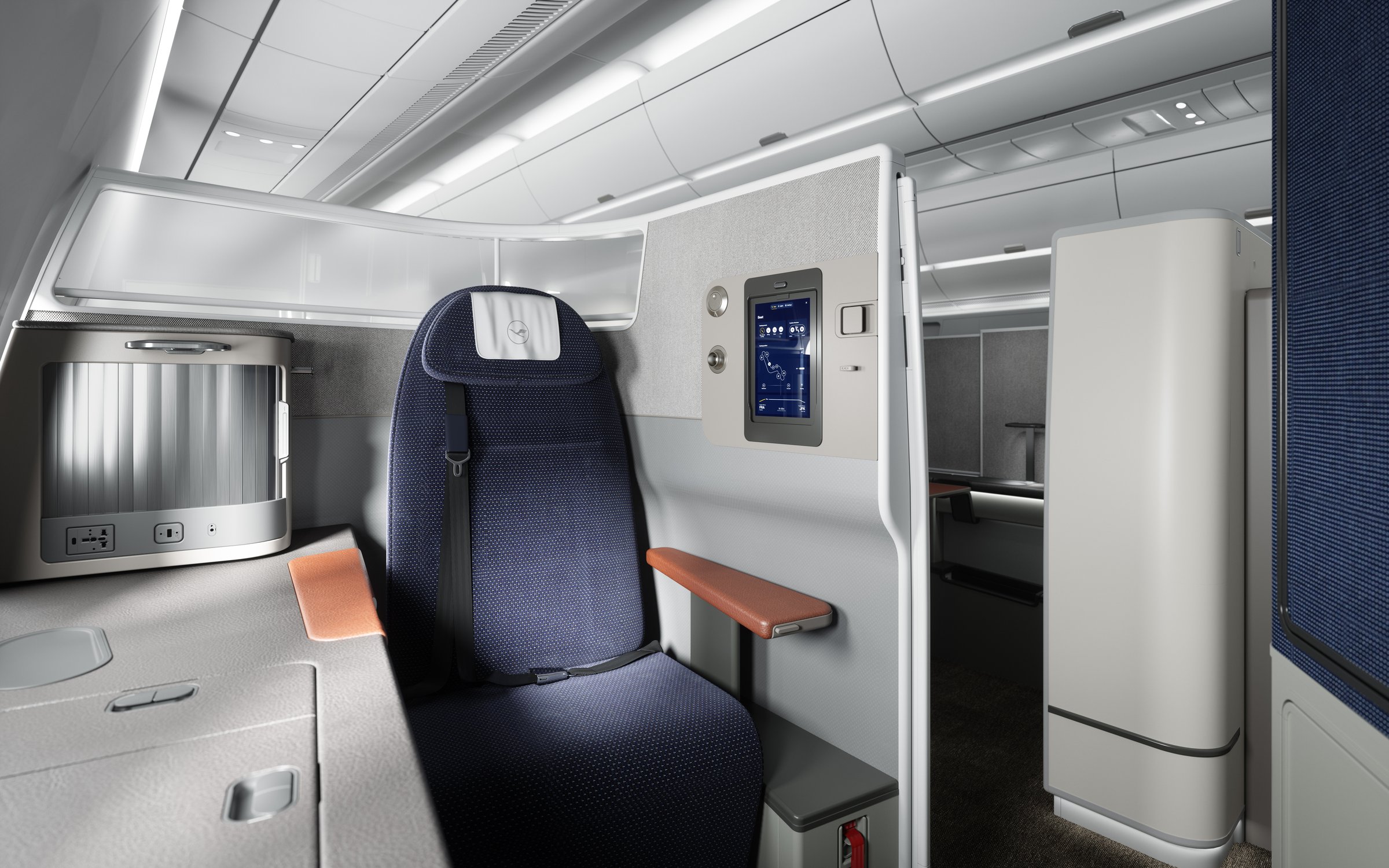
The default answer across much of the industry is neutral: evenly lit, every surface visible, every seat in focus. It is technically correct. It also produces images that are difficult to distinguish from one studio to the next.
The alternative is an approach borrowed from cinematography — where lighting, depth of field, and colour are treated as deliberate tools rather than technical defaults. This is the approach we use, and this article explains the thinking behind it.
What cinematic actually means.
In this context, cinematic does not mean stylised or dramatic. It means that every element in the frame — the direction of light, the focal length, the colour temperature — is chosen to serve a specific purpose. The light falls as it would at a particular time of day and altitude. The depth of field directs attention to a surface or material before the eye takes in the wider cabin. The colour palette is considered rather than neutral.
The distinction is between an image that documents a cabin and one that communicates the experience of being in it. Both are accurate. One serves the programme better.
Lighting approach.
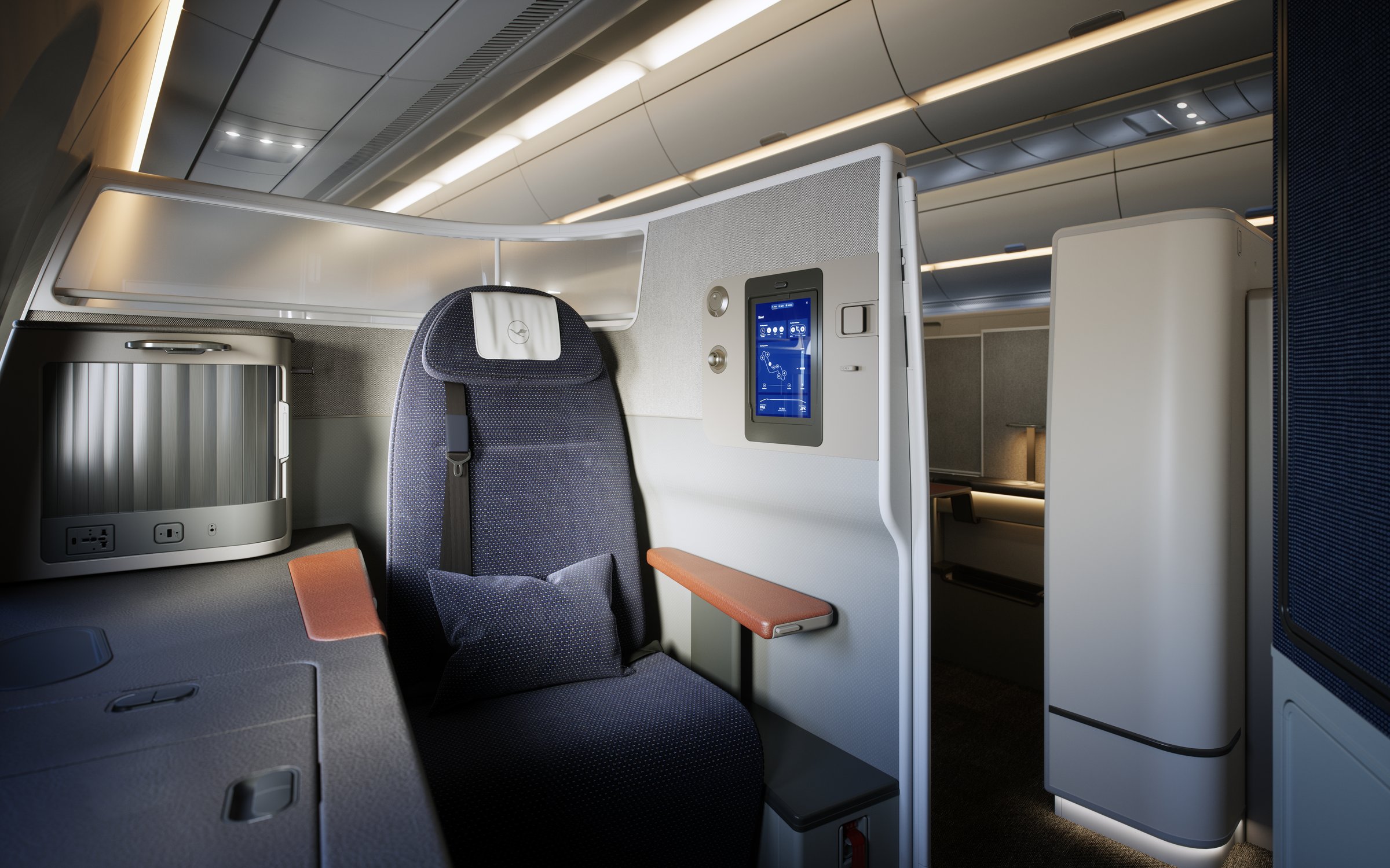
In a real aircraft cabin, light arrives from a limited number of sources: windows, overhead reading lamps, mood lighting strips, IFE screens. Each has a distinct colour temperature, intensity, and falloff pattern. Reproducing these accurately — rather than replacing them with uniform studio lighting — creates the depth and atmosphere that separates considered visualisation from a catalogue render.
Window light rakes across surfaces at an angle, producing shadow that reveals surface detail. Mood lighting introduces warm colour pools that establish a sense of time and place. Reading lamps create small, focused highlights on material textures. IFE screens contribute a subtle cool fill. Each source is placed and tuned individually.
The result is an image with the kind of tonal variation that exists in real environments — areas of brightness and shadow that the eye reads as natural rather than computed.

Composition and camera language.
Each camera position in a cabin programme serves a different communication purpose. A wide shot down the aisle establishes cabin density and premium positioning. A low angle from the suite entrance approximates the passenger's first impression. A tight crop on a material surface — wood grain, leather, textile weave — communicates design quality without requiring the viewer to interpret the full cabin.
A typical programme requires all three perspectives, and each demands different optical decisions: focal length, depth of field, height, and angle. The wide shot might use a 24mm equivalent to convey space; the material close-up might use an 85mm with shallow depth of field to isolate a surface. These are the same decisions a director of photography makes on a commercial shoot.


Colour grading in CGI.
Colour grading is a standard post-production step in film and photography that is often omitted in CGI pipelines. The difference is visible. Ungraded renders tend to have uniformly clean highlights, neutral shadows, and a narrow mid-tone range that reads as digital even when the geometry and materials are accurate.
A considered grade introduces the tonal characteristics of real optical systems: slight warmth in the highlights, a cooler shift in the shadows, a gentle rolloff at the top of the exposure range. The adjustments are subtle — heavy-handed grading is as conspicuous as none at all — but they shift the image from a render into something the eye accepts as photographic.
Context and application.
Cabin CGI exists within a broader visual environment. The airline's own brand photography, the premium brands their passengers encounter daily, the design press that will publish the images — all of these set an implicit standard. If the CGI sits below that standard, the cabin product is underserved regardless of its actual quality.


The visualisation should be indistinguishable from considered photography — not to obscure the fact that it is CGI, but because the product warrants that level of care.
This is the standard we work to across cabin renders, reveal films, and pre-delivery asset programmes. The lighting, composition, and grading approach described here is applied consistently across every project.
